


We've just introduced the new pagination interaction that is I think quite innovative compared to what's out there.
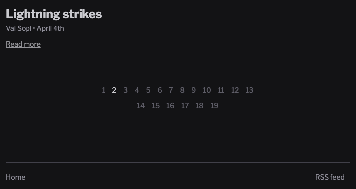
Some blogs in blogstatic have a ton of content and their pagination showed like the one below.
This was particularly gruesome for customers with hundreds of posts. Their pagination links were in the 30s and beyond.
Not pretty 😬
Here's how that looked like, up to now.
The solution
Thanks to one of our customers who was pretty vocal about this, we set out to solve it.
The first instinct was to do what most blogs do and show the current page the reader is on with a few navigational cues.
« ‹ 3 4 5 › »
However, the issue with this approach was that it didn't make it clear how many pages there are in total without clicking the "»" sign and seeing the end of it all.
Also, if I wanted to get to page 27 of 98, the only way was by clicking the "›" numerous times until I got to that number.
There had to be a better way.
I have not seen it done like this, or my research is insufficient.
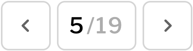
Now, regardless of the number of pages in a blog (a few or many), the interface is always the same.
This new approach gives the reader a way to go back–and–forth instantly, as well as jump to a particular page immediately, while always knowing how many pages there are in total.
BTW, the total number of pages can change within a single blog depending on where the reader is currently on: the Homepage (all posts), a category page, or a single author page.
Watch the video below to see it in action (with my narration).
I hope you like it and let me know what you think.