

In this post: Announcing the new Gallery feature, removing the matching editor area, adding the Preview button, and a few other improvements to the editor.
This is a big one!
Not only the gallery feature itself but a few other changes that we had to make to the editor.
Quick note: The Gallery feature is available on the Expert Plan and above.
Look at our pricing page for more details.
Removing the matching–editor area
Up to now, the editor was matching the chosen theme, so writers didn't have to preview their posts before publishing. The writing was the actual post.
This was great for perfectionists like me. I could write my post exactly as it would show when published.
However, if someone wrote custom CSS for their blog, they would have to write more custom CSS just for their editor so it matches their blog. A messy proposition really.
Now, the editor will always be the same — regardless of what custom CSS or other code injections we implement to the blog.
This makes things easier from the maintenance perspective.
If I can be honest, I already do miss the matching editor area, but it had to be done so everything runs smoother.
On to the Gallery feature
Before the Gallery feature, there was a way to add images to the body of your posts. However, they would have to be uploaded one–by–one without a way to arrange them nicely.
Also, there was no lightbox, in which you click on any of the gallery images and a nice pop-up shows up.
See what I mean exactly by clicking on any of the gallery images below.


So there you have it. The new gallery feature is already live at the time of this writing. And you can add as many galleries as you want to a single post.
Multiple Editors on a single post
Since Galleries sit outside of the editor, we needed a way to distinguish between text editors and galleries. Because of this, now you can add as many editors as you need and rearrange them throughout your post.
Some text
At the bottom right of each Element (Editor, Gallery, etc.), there is an option to add more elements.
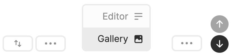
At the point of this writing, you can only add an Editor or a Gallery.
Soon the CTA will be added to the mix and any other options that we and our users may need.
The Preview button
By removing the "matching editor" feature, a new opportunity opened up for the Preview button.
Before publishing your post, now you can quickly click on the Preview button and see how your post will look in the wild.
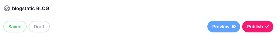
The Preview link is always public, so you can share it with anyone else on your team.
Other improvements
A few other improvements were made:
Optimizations when a post is saved: A quicker way to save the post and only when needed, thus requiring fewer HTTP requests to the database (apologies for the tech jargon).
Options on Post Settings: UI toggle buttons for —
- Share buttons
- Pin to Top
- Table of Contents
- Unlisted
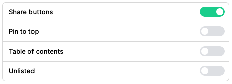
These used to be with a drop-down which took a ton of space and wasn't very neat to use.
What do you think?
We really hope you like these new improvements and especially the new gallery feature.
Let us know what you think on our community page on Reddit.
Found in:
Features