


Our goal here at blogstatic is to continue to make it simple for content marketers to start publishing their content without being overwhelmed with the complexities of installing, hiring coders, hosting, etc.
With blogstatic, you can focus on what you do best, writing — and let us do the heavy lifting behind the scenes.
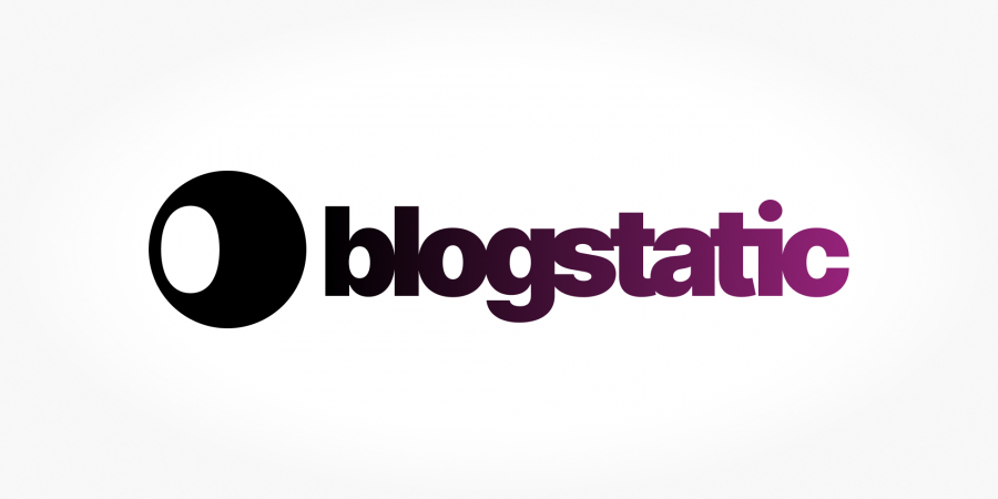
Our identity
Staying true to that premise, we're happy to reveal our brand identity.
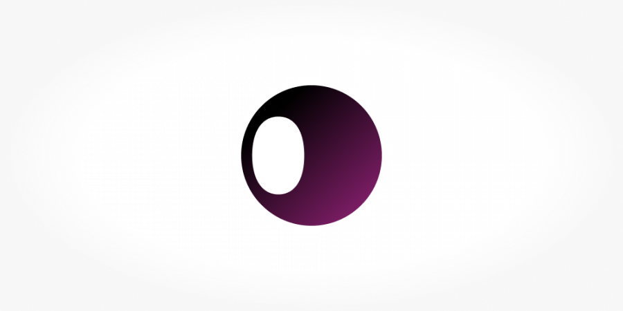
The symbol to the left of our logotype is made of a full circle and the counter inside the letter "b" — the first letter of our name.
The circle represents wholeness, perfection, and our never ending attempt to continuously improve our service.
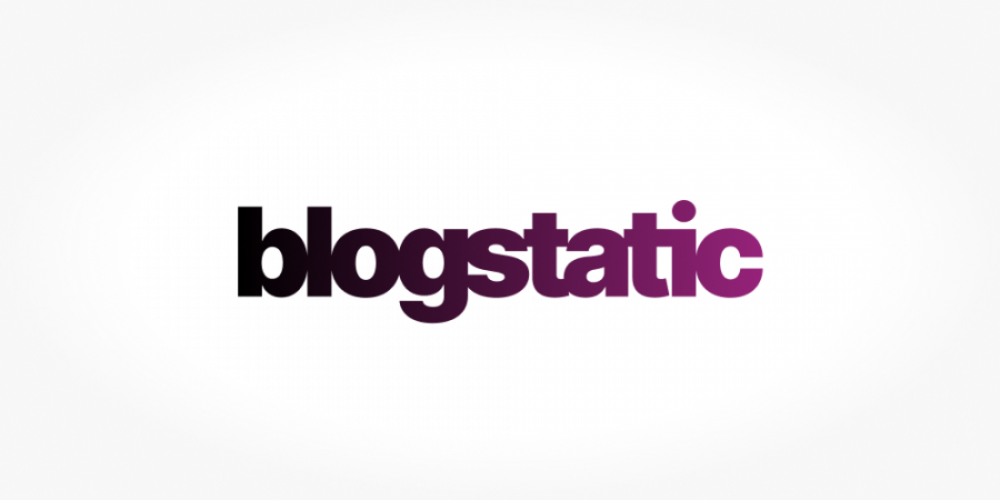
The logotype is written using Inter typeface. In the words of its maker, Rasmus Andersson — "Inter is a typeface carefully crafted & designed for computer screens".
Negative letter-spacing is meant to let the eye quickly read the name. The ligature on "ti" is the only modification to its form.
The gradient on the logo is meant to add a subtle movement to the overall simplicity of our brand identity, symbolizing progress.
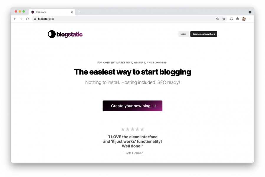
By having our logo ready, we released our new website as well.
Again, as with our logo, a simple approach that helps the user get to the "next step" of creating their new blog, was the main strategy behind the homepage our website.
For those wanting more, the footer holds links and resources to everything in and around blogstatic.
The revealing of our brand identity goes in hand with our dedication announced yesterday to running a business that cares about our planet and the minimal footprint it leaves behind on the environment.
Visit thew blogstatic.io website.
Follow us on twitter for latest announcements.